New York City is embarking on a mission to redesign 1,000 intersections to make them safer for pedestrians.
This is no small task, but it’s an important one. Cities and states across the country are prioritizing road safety and Vision Zero programs amid a troubling rise in road fatalities. The U.S. Department of Transportation’s new National Roadway Safety Strategy asserts road safety as a top priority, making it clear that there is no acceptable number of deaths on the nation’s roads.
Making 1,000 intersections safer can have a transformative effect on New York City. But even the first step is a daunting one: New York has more than 50,000 intersections, and crashes were reported at about 16,000 intersections in 2019. How can the city decide which 1,000 to prioritize?
Replica created a new dataset and an interactive map to help policymakers and the public understand more about the intersections where incidents occur.
Explore a preview of the map above, or click here to access the full map and all our data filters in Unfolded.
We’ve highlighted a few takeaways below.

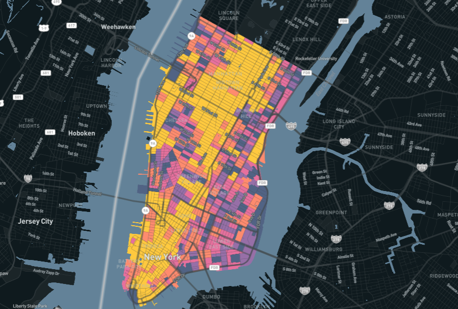
Left: A heat map of injury rates at the 1,000 busiest intersections in New York City.
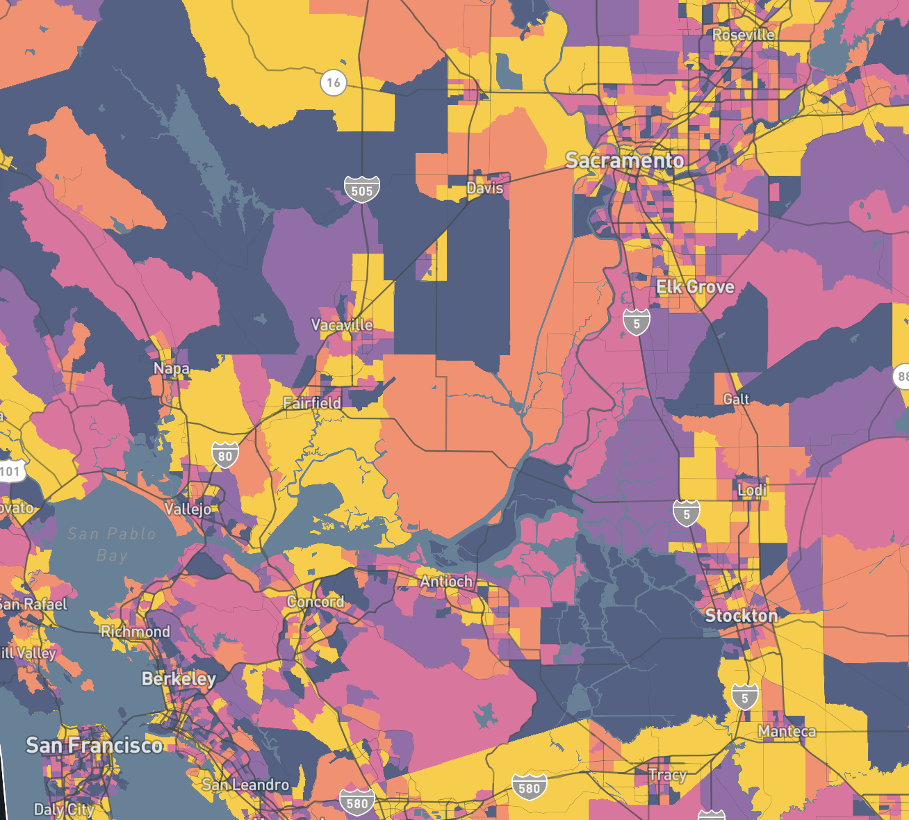
Right: A heat map of injury rates per traffic volume at intersections across New York City.
Busy intersections might jump to mind as being the most dangerous, but it’s worth checking that assumption.
The map on the left shows injury rates at the 1,000 busiest New York City intersections. This view lights up Midtown, Lower Manhattan, and a few key corridors that lead there. These are places that are known for being hectic and might seem like obvious targets for street improvements. (Injury rates in these maps are calculated as annual injuries per 1,000 daily auto trips in 2019.)
The map on the right, however, shows injury rates at all intersections that logged an incident in 2019. From this view, it’s clear that busy intersections aren’t necessarily the most dangerous ones: Large portions of Brownsville, East New York, and Claremont Park stand out as having much higher injury rates than the busiest intersections, even though they have lower traffic volume.
Low-income Travelers

This map shows injury rates only for intersections where the majority of trips are taken by people with low incomes. We can see geographic similarities with the second map above, highlighting ways that unsafe intersections contribute to inequities in the built environment.
Seniors in Vision Zero Areas

New York City has identified Vision Zero Priority Areas for targeted attention. This map shows where senior citizens on foot or bike make up higher shares of all trips taken at intersections around Brooklyn’s Atlantic Avenue.
For any public agency making investments in safer streets, it’s important to use comprehensive data to make the most informed decisions. But that’s only half the battle.
It’s also important to have the right tools to communicate that data — and decisions based on it — with policymakers and the public. That’s why Replica makes its data available in ways that customers can easily integrate it into their own data, workflows, and tools, like we did here New York City’s data and Unfolded’s mapping platform.
Over time, that same combination of comprehensive data and tooling can help you monitor the outcomes of these investments to learn what works, what doesn’t, and who benefits most, when creating safer intersections for pedestrians.


.jpg)

